Apricus+ — a multi-brand member engagement product
Led the design of a modular, scalable white-label app framework, enabling fast and tailored app rollouts in the F&B sector.
OVERVIEW
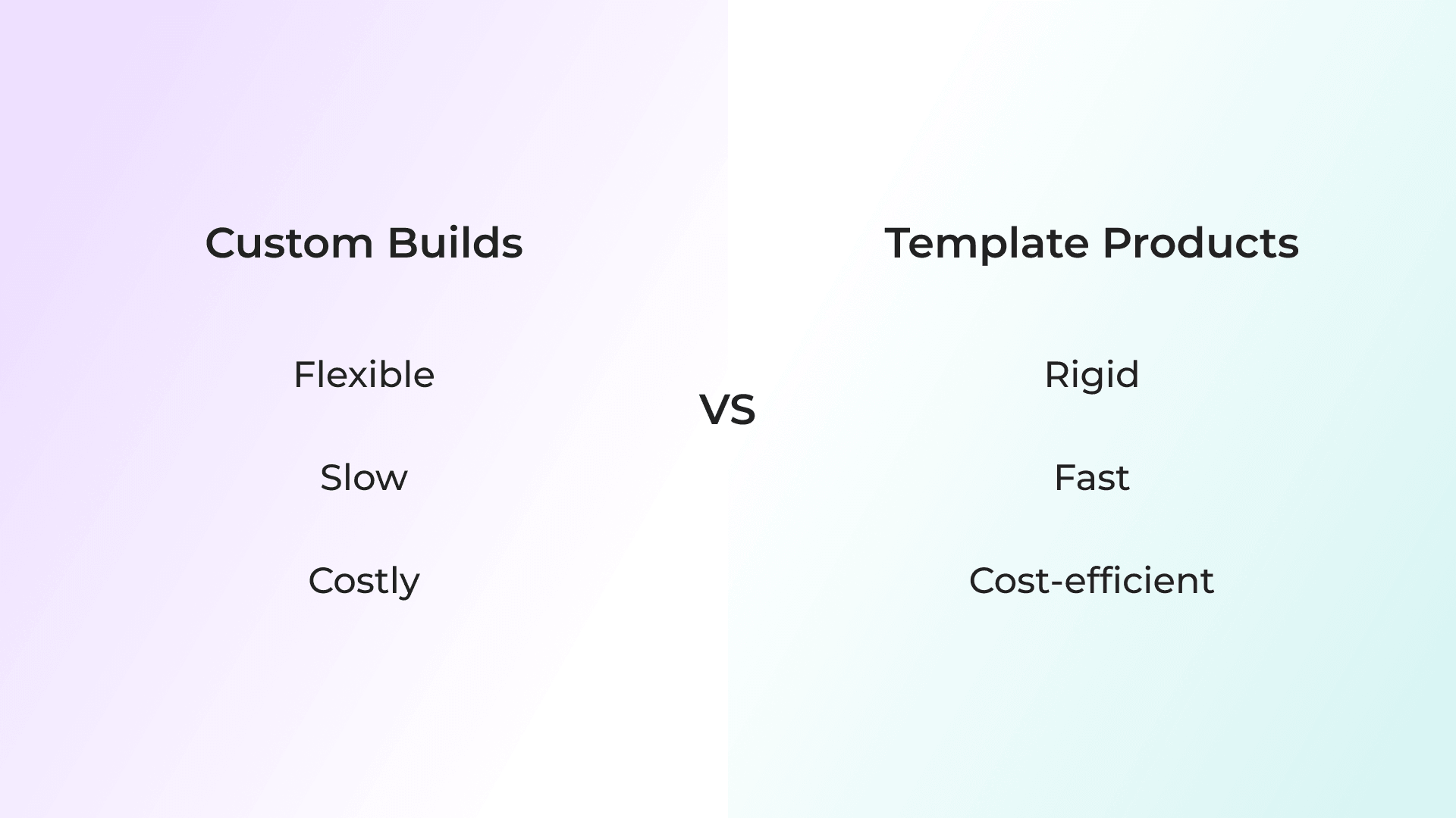
Apricus+ bridges the gap between slow, costly custom app builds and low-cost, rigid templates.
Designed for F&B, it’s a modular, white-label app framework enabling rapid deployment and flexible configuration — accelerating time-to-market while adapting to different business needs.
ROLE
Sole Product Designer
TEAM
1 Technical Lead, 1–4 Software Engineers
TIMELINE
February 2024 – April 2026 • 6 months of active design
PROBLEM
Trapped between custom builds and rigid templates
The F&B sector needed a fast, scalable way to launch branded apps that drive customer retention.
However, existing solutions sat at two extremes: custom builds offered flexiblity but were slow and costly, while template products were fast but overly rigid, limiting brand expression and ability to support different business needs — leaving no viable middle ground.
CHALLENGE
Create a product that scales membership apps across multiple brands, balancing efficiency with brand differentiation and business adaptability.
STRATEGY
A pilot-led approach
Rather than designing for scale from the outset, I adopted a pilot-led approach, grounding the foundation in a real client.
While a single client cannot represent the entire market, starting here allowed me to:
- Prioritise real operational needs over assumptions
- Design for messy, real-world data instead of idealised scenarios
- Uncover hidden technical constraints, particularly around core API integrations
- Validate core functions and establish a robust baseline before scaling
PHASE 1
Establishing the Foundation
PILOT CONTEXT
Redesign and launch a membership app in 4 months
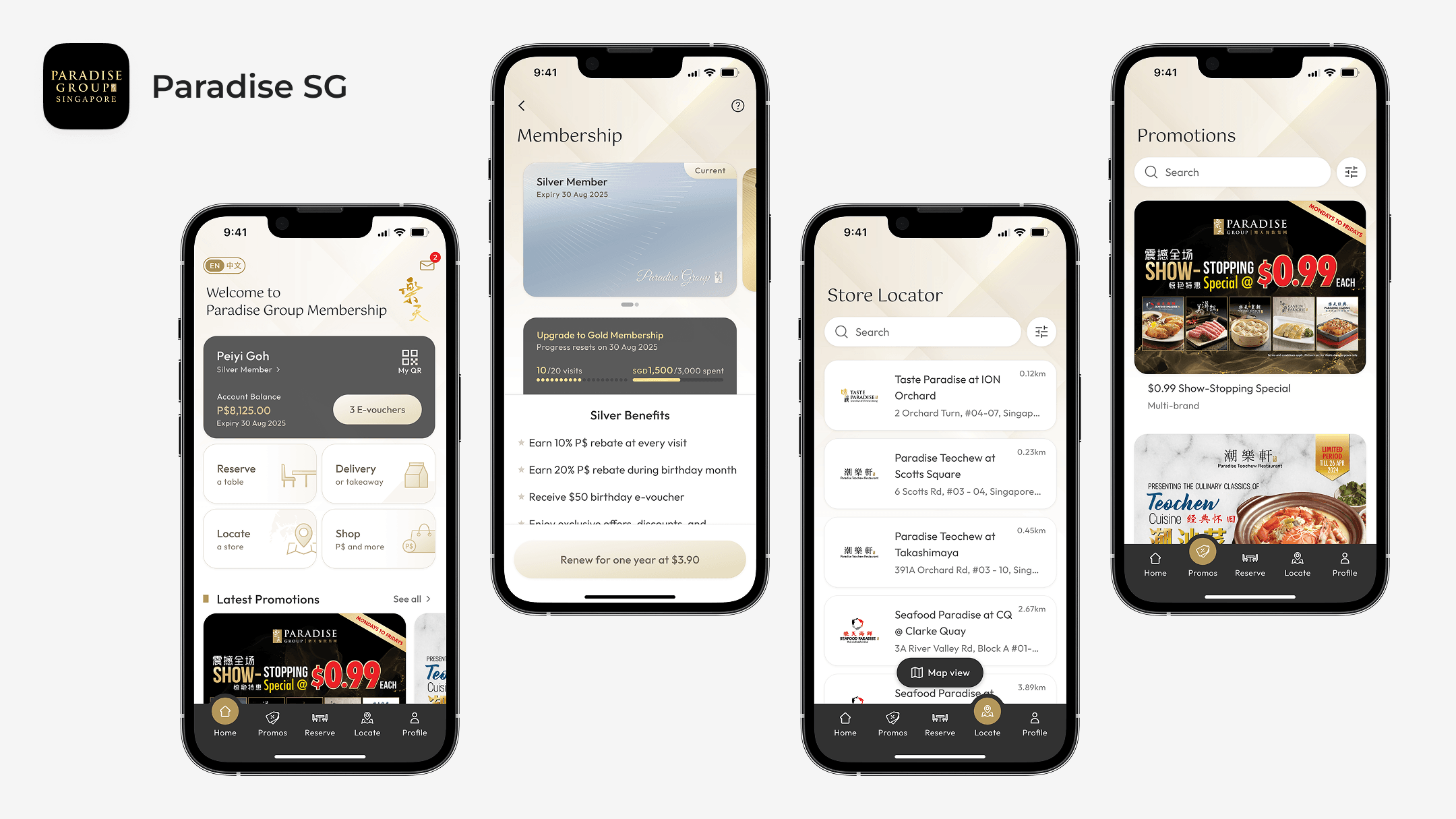
Paradise Group, a Singapore-based F&B company with a global multi-brand portfolio, served as our pilot client.
We were engaged to redesign and launch their membership app within a four-month MVP timeline, while supporting their transition to a new CRM system.
KEY USER ISSUES
Surfacing recurring usability issues
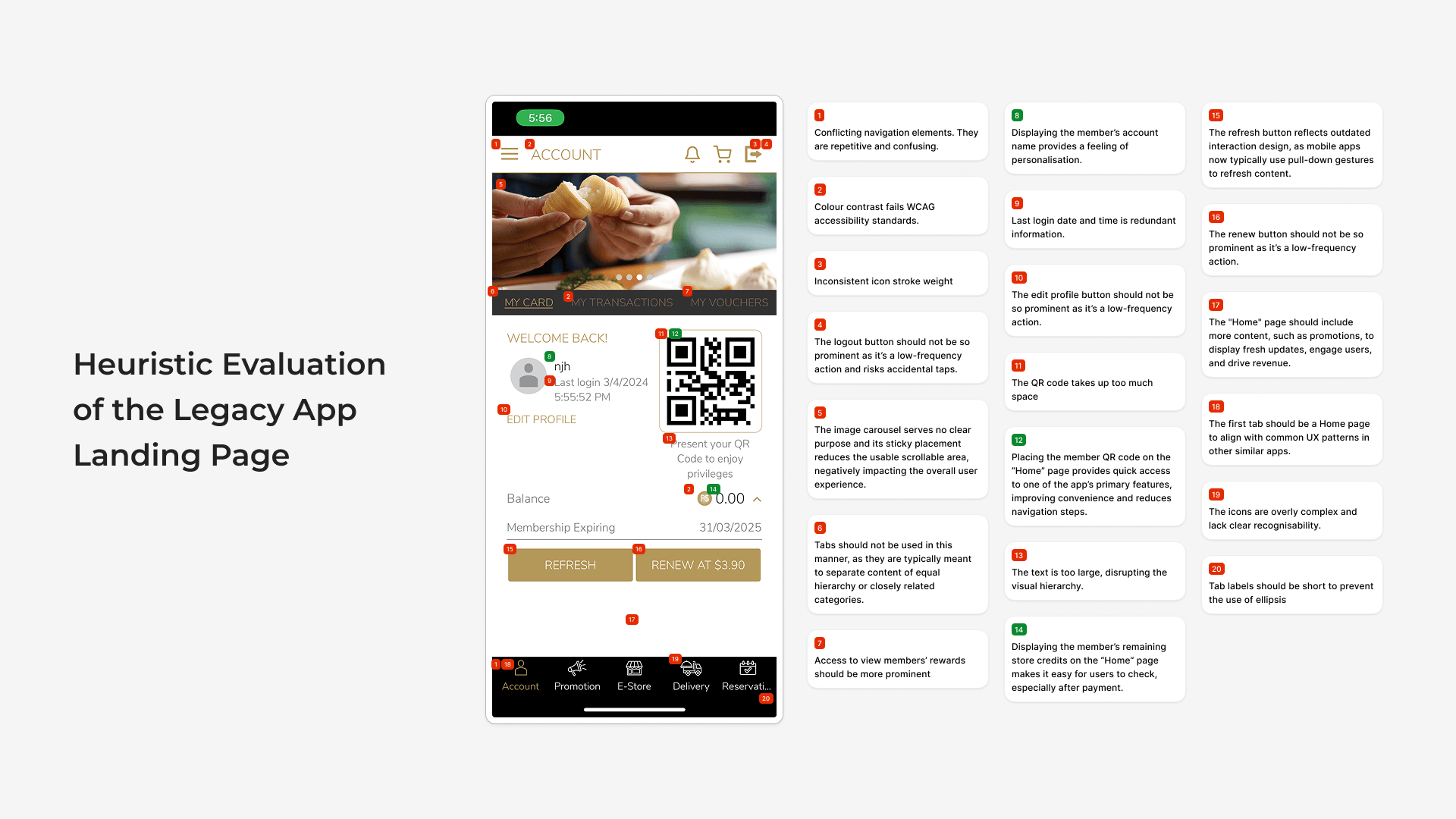
The existing app held a 1.7 App Store rating, signalling poor user experience. To understand where it was breaking down, I reviewed user feedback and evaluated the interface using heuristic principles.
This surfaced recurring issues that directly impact usability and member engagement:
- Low sign-up motivation due to unclear membership value
- A long and confusing sign-up process
- Login friction from forgotten credentials
- Poor information hierarchy across the app
DESIGN PRIORITIES
Membership visibility, onboarding, and login
The issues converged on three core areas — membership visibility, onboarding, and login — which shape how users understand, join, and access membership. Given their fundamental role across membership apps, these areas were prioritised to establish a scalable foundation.
We were engaged to redesign and launch their membership app within a four-month MVP timeline, while supporting their transition to a new CRM system.
KEY DESIGN DECISION 1
Surface membership value and access
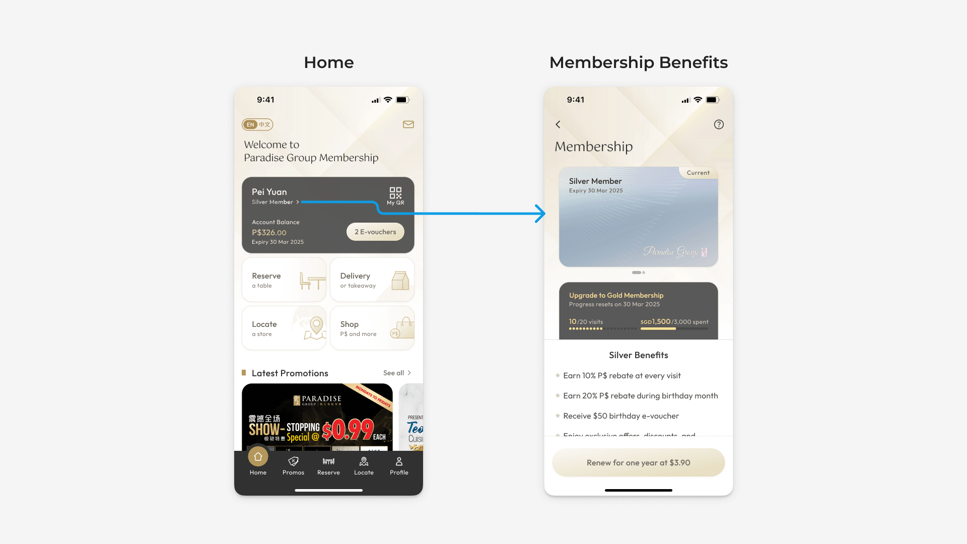
Guests were expected to sign up without understanding the value of membership, while existing members struggled to access key information and benefits due to poor information hierarchy.
I introduced a membership benefits page accessible to both guests and members to communicate membership value upfront, while redesigning the member landing page to surface key information — tier, balances, and QR code access.
KEY DESIGN DECISION 2
Lower barriers to entry
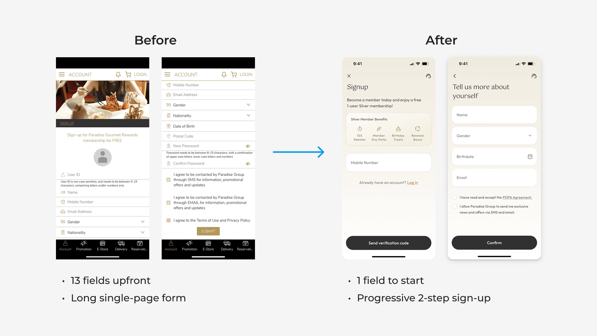
Collecting member data helps businesses understand customer needs and drive decisions. However, requiring extensive information upfront during sign-up creates unnecessary friction.
I lowered the barriers to entry by cutting initial fields from 13 to 1, and captured remaining details through a streamlined two-step flow — balancing conversion and data needs.
KEY DESIGN DECISION 3
Move beyond credential-based login
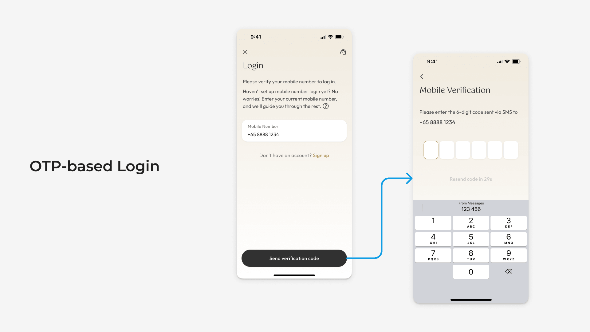
Members frequently forgot their username and password, creating friction at a critical point of access. This was compounded by the lack of self-service recovery and no clear access point to customer support.
I reduced reliance on memory and support by shifting away from credential-based login and introducing OTP-based authentication, which also enabled mobile number verification. A dedicated support button was also added, providing a clear fallback when needed.
This approach remained effective even under imperfect data conditions. Designing an additional verification flow on top of OTP login for Paradise Group, enabled existing members to access their accounts despite unverified contact data and unavailable legacy credentials.
PILOT OUTCOME
Validation under real-world constraints
The redesigned app launched on schedule, replacing a system that no longer met user needs.
- Improved App Store rating from 1.7 to 4.2
- Reached #4 in the Food & Drinks category shortly after launch
- Enabled the estimated 150,000 active members to access their existing accounts in the new system despite legacy data challenges
- Achieved a smooth transition with minimal dependency on customer support
These outcomes validated that the key design decisions established through the pilot were effective under real-world constraints and could be scaled across future apps.
PHASE 2
Scaling into a multi-brand product
OBJECTIVE
Reduce redesign and redevelopment
Following the pilot, the focus shifted towards turning the validated foundation into a reusable system that reduces redesign and redevelopment effort for new apps, while supporting variation across brands.
SCALING APPROACH
Balancing standardisation and flexibility
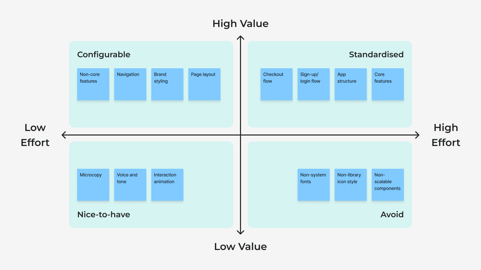
Scaling the product required deciding what should remain consistent and what should adapt across brands. These decisions were evaluated based on the value of customisation against the effort required to design, build, and maintain it. High-complexity areas remained standardised, while flexibility was introduced where it created value for each brand.
FOUNDATION
Define a reusable app structure
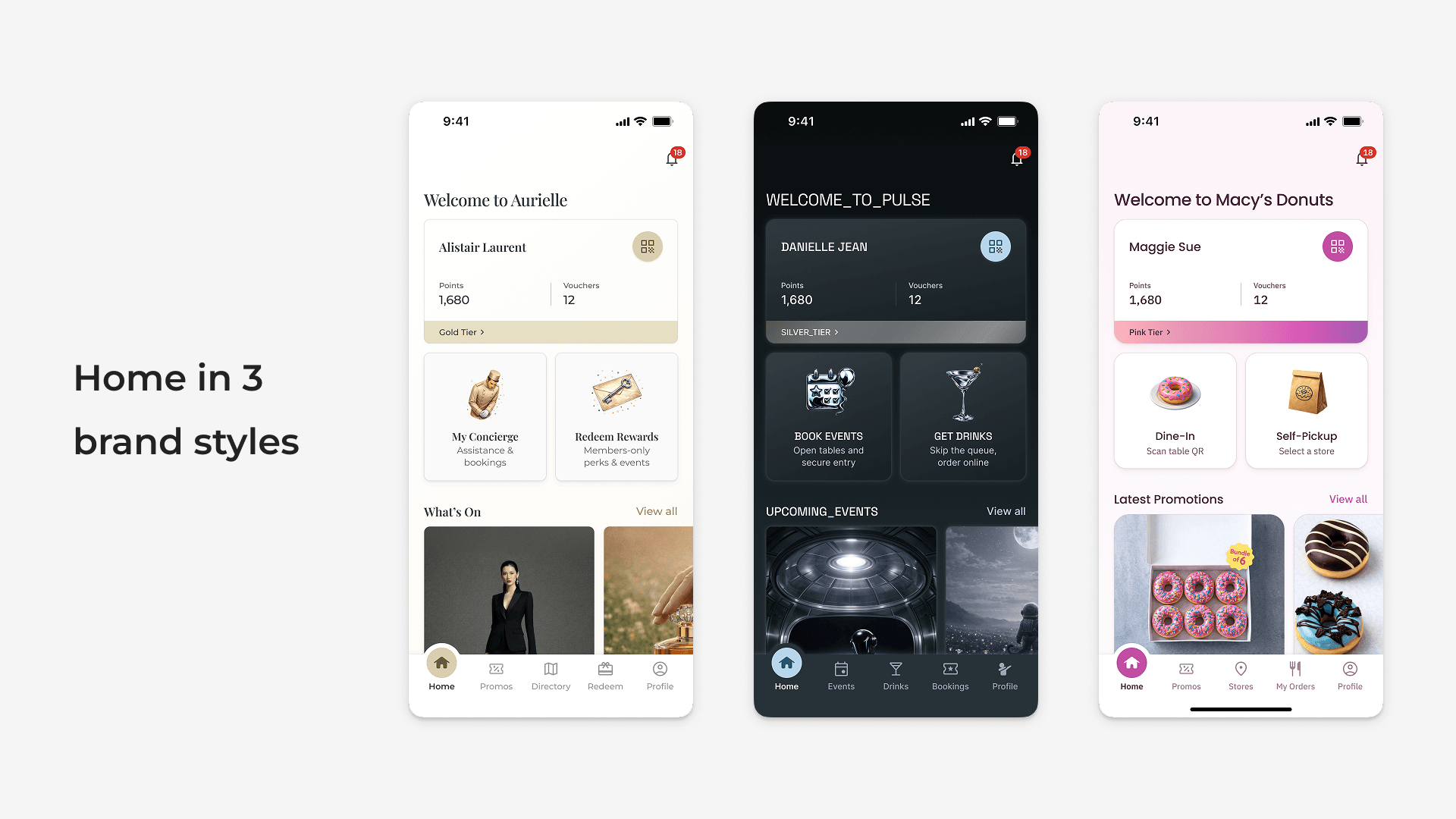
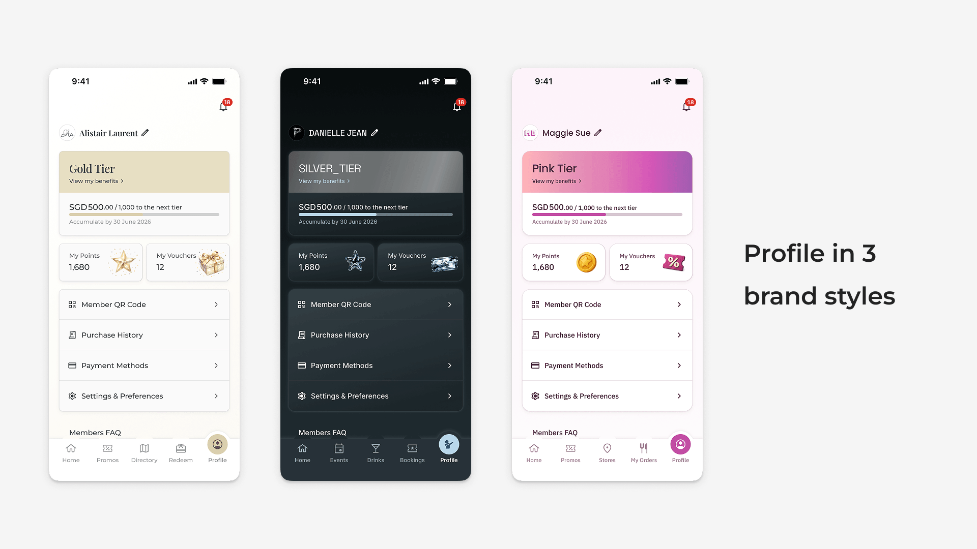
I established a baseline app structure and core feature set as a starting point for future implementations, allowing new apps to be built from an existing foundation rather than designed from scratch. This reduced effort while maintaining a consistent user experience.
STANDARDISATION
Standardise complex flows
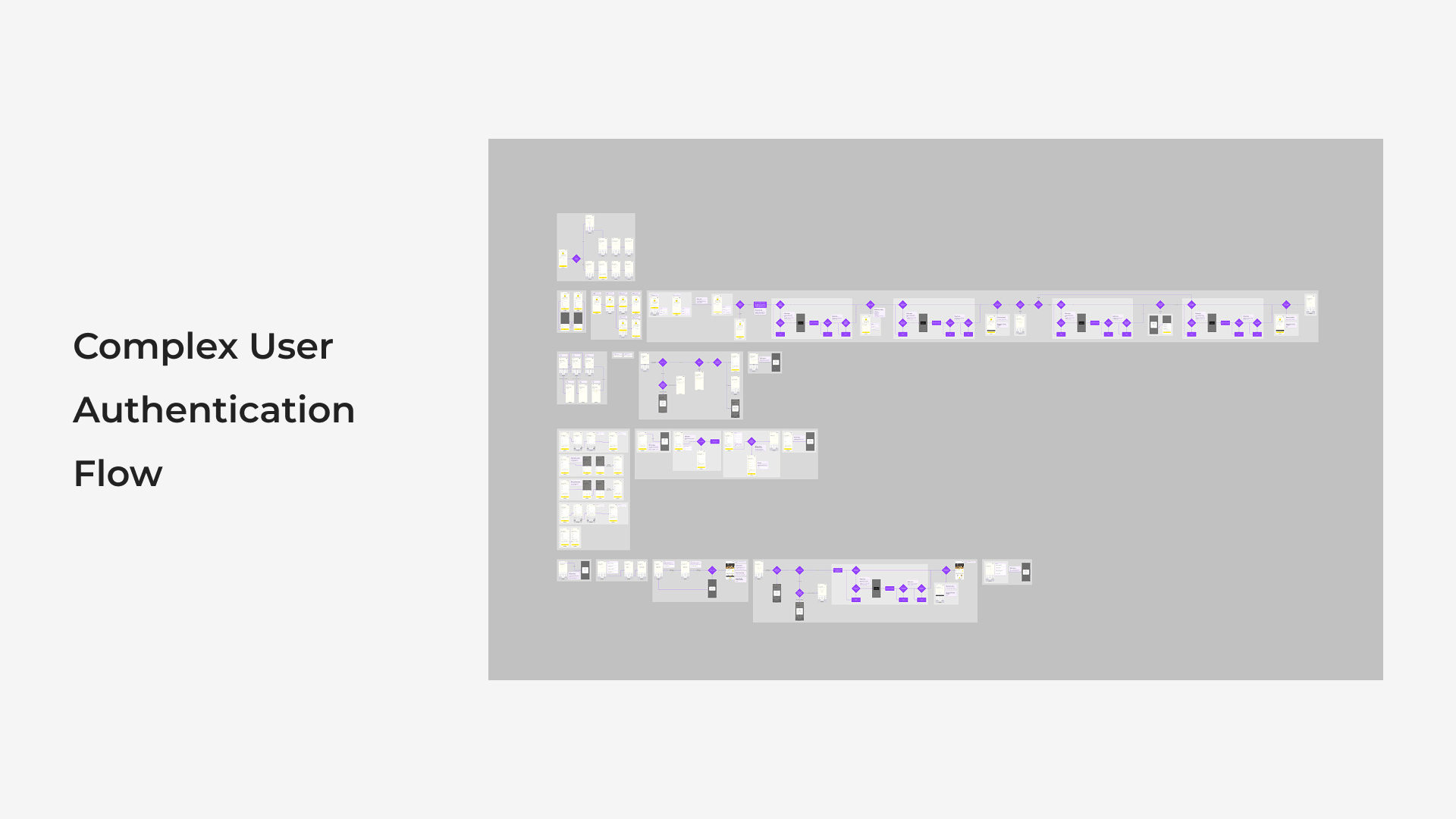
Flows such as login and checkout were kept consistent due to their tight coupling with backend systems, APIs, and complex logic. Customising these would introduce significant engineering and design overhead, so they were treated as fixed patterns across all apps.
CONFIGURATION
Enable brand-specific configurations
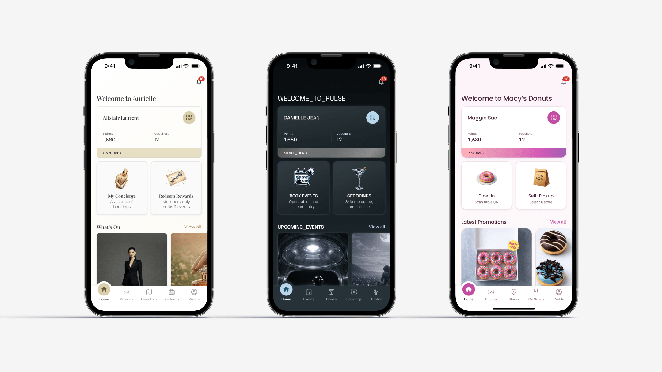
Beyond the baseline, I enabled flexibility in feature selection, navigation, and layout. This allowed each brand to prioritise what drives their business — whether that’s promotions, food ordering, or wallet top-up — while building on a shared structure.
SYSTEM
Systemise brand styling
I created a white-label design system using Tokens Studio, defining reusable tokens and components that adapted across brands through different styling configurations — maintaining consistency while reducing per-brand design and development effort.
SCALING OUTCOME
Faster launches, tailored brand experiences
The modular white-label framework shifted app launches from designing each app from scratch to adapting a reusable product foundation.
This shift compressed design timelines by 75% — from two months to two weeks — while streamlining development and future enhancements.
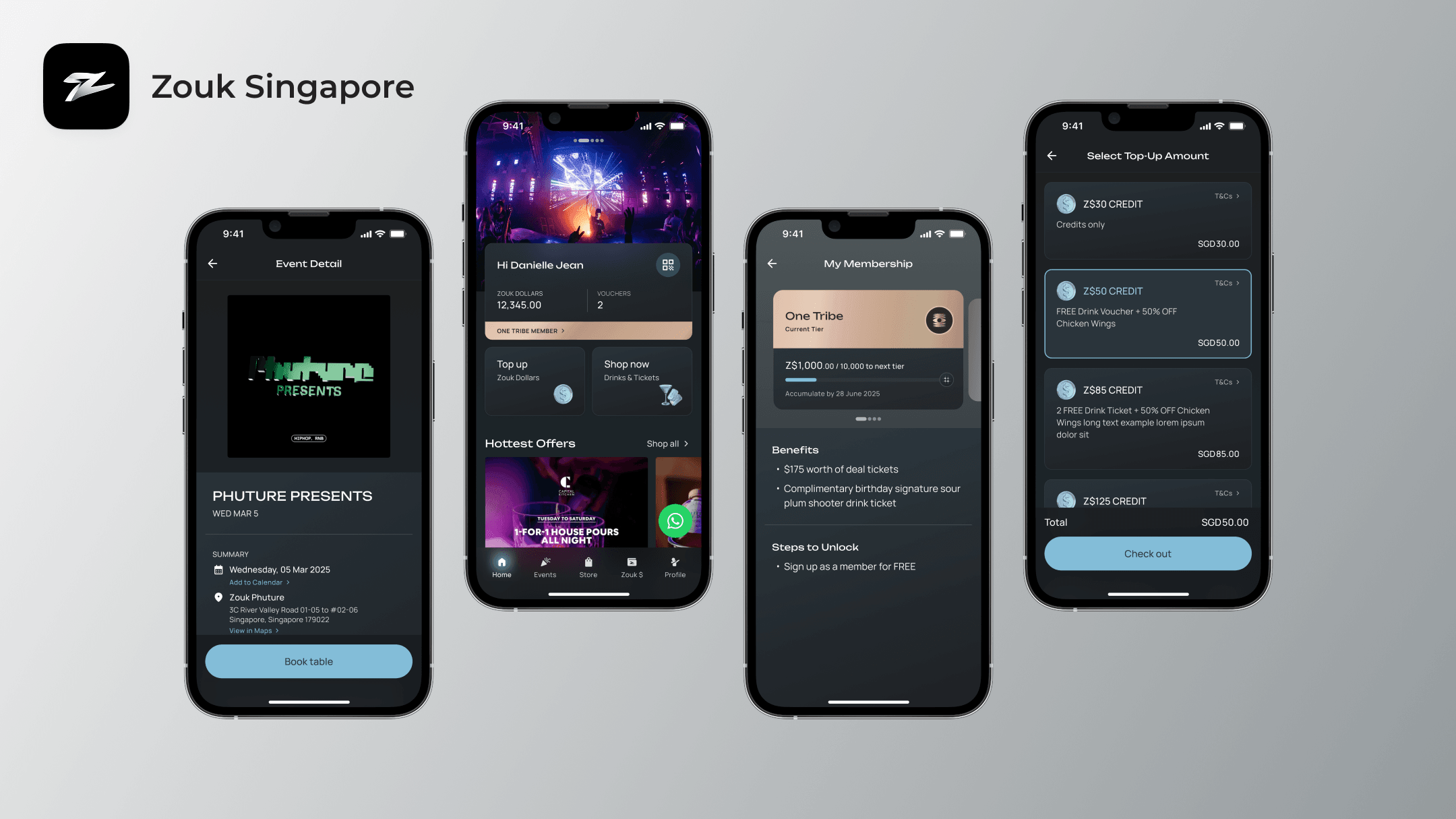
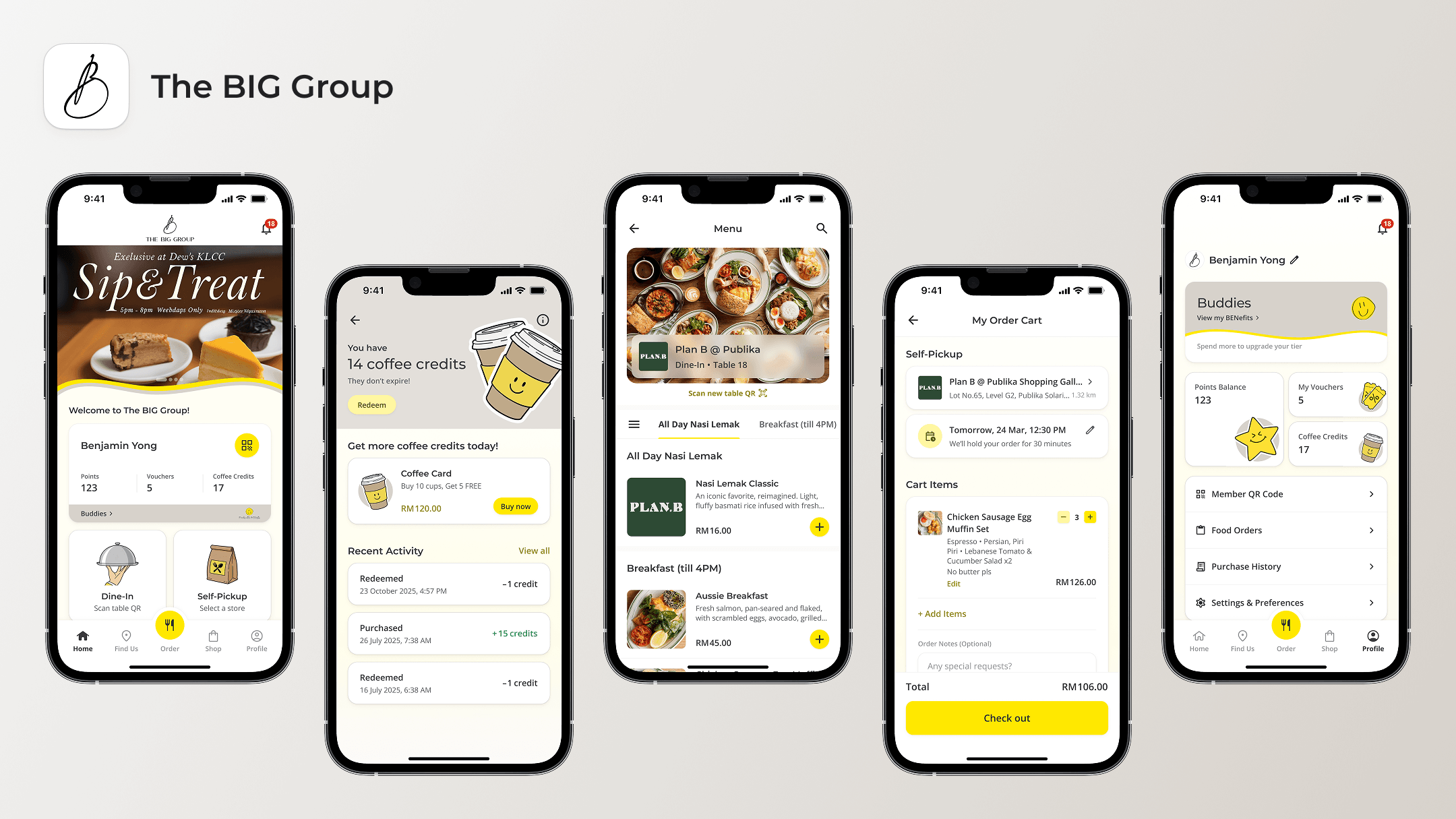
The framework’s adaptability was proven through subsequent projects for Zouk and The BIG Group, demonstrating how a single shared structure could support distinct brand identities and business needs.